A self storage service that helps you make space for what matters
From the outside, self storage is an industry that seems pretty quiet, until you need to use it. Then it's a loud arena to enter into: brands are big, safe, sure, bold and brightly coloured.
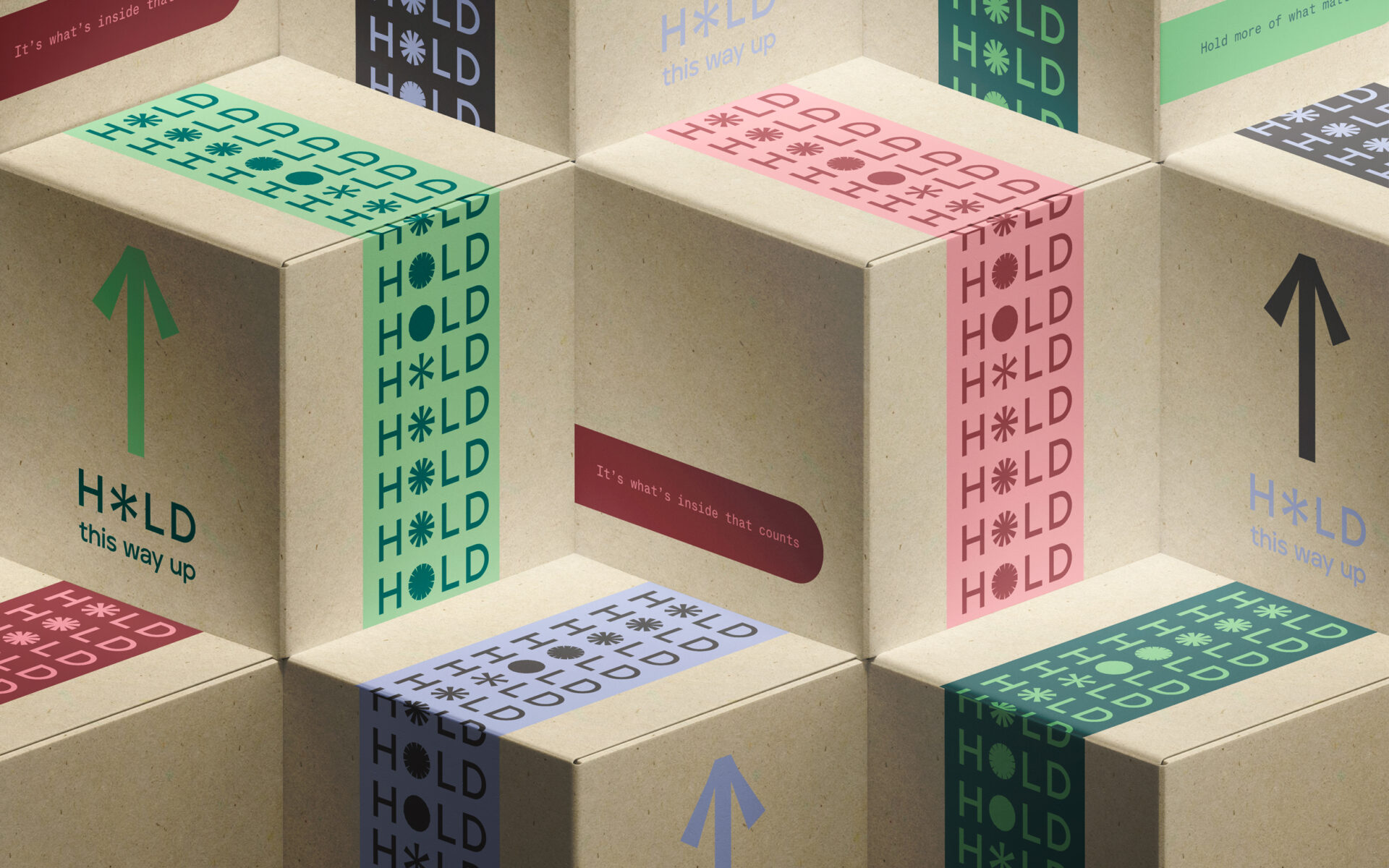
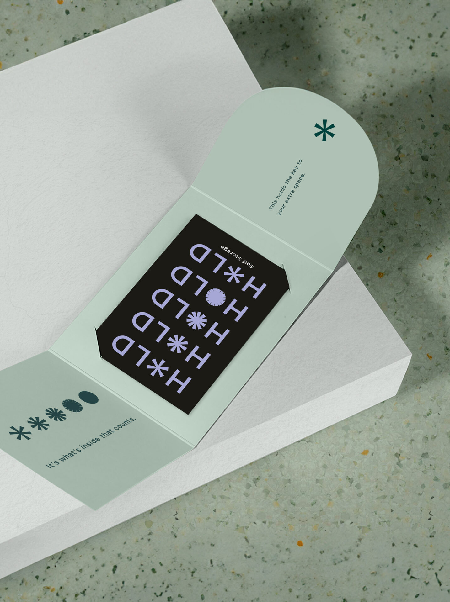
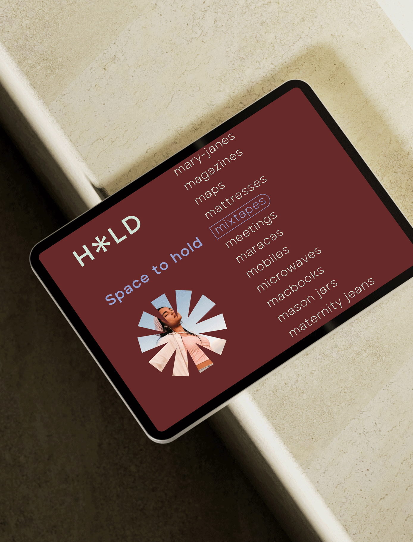
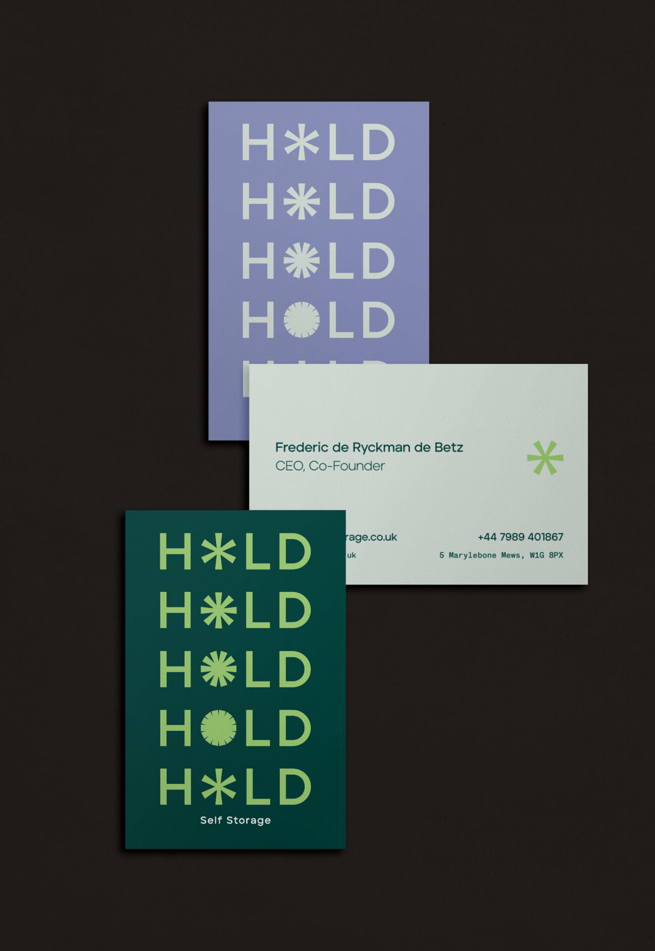
When tasked with designing a new self storage brand that could break through the industry noise, our research and intuition pointed us in the direction of focusing of the "self" in self storage. The result is HOLD: adaptable, accessible storage solutions to give you space to move, breathe & change.
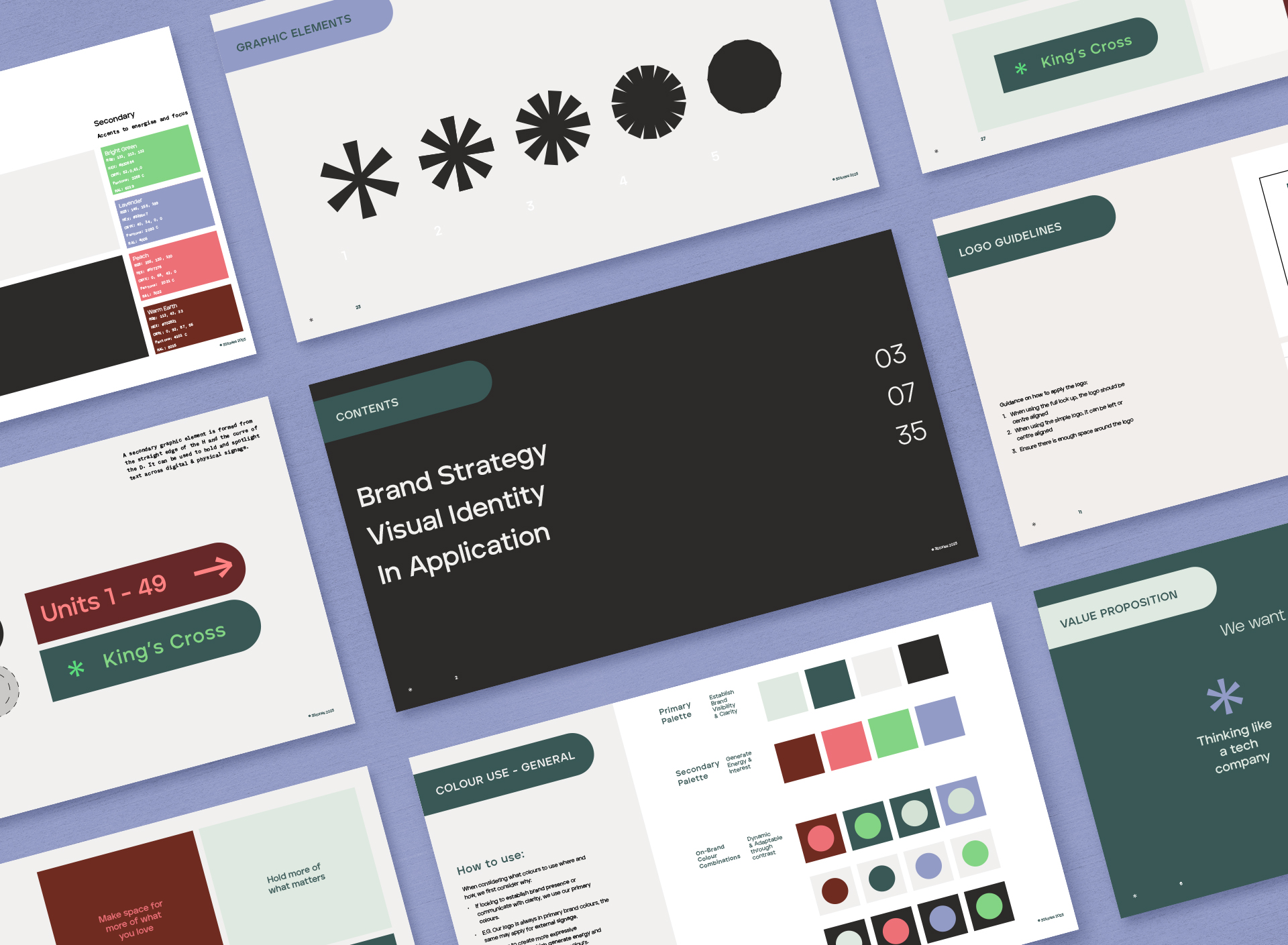
We developed a set of asterisks as the primary graphic element. They symbolise the brand promise: to make space for what matters and evoke the physical and emotional duality in the meaning of the name HOLD.
To break through the oversaturated, monochromatic brand space, we balanced a palette of warm neutrals with pops of contemporary bright colours.
This broad palette also allows flexibility across a growing brand and its multiple touchpoints.